Friday, 15 January 2016

Landscapes, Landscapes and Starting Again!


So the 21 day art challenge was going pretty well.......then the weekend hit and my social life derailed it completely! So we got through a total of 5/21 before I failed, not very impressive is it! My original plan was to just carry on from where I left off but I feel like that defeats the whole purpose of the exercise. So I have decided to start again back to day 1, albeit with a few more back up plans for if I'm going to be unable to post that day. Here's hoping I can pull it off this time.


Above is day one of the second attempt if you're wondering, this is actually my second attempt at todays piece, the other piece has been saved away for possible use later on, it involved over cast lighting and I really seem to struggle with that. That's why I went with the very stark lighting you see in the above painting, it's a little more forgiving and to be honest looks a lot more exciting. Till next time! 


Sunday, 3 January 2016

Back From The Dead

 
It's a new year and that means it's about time I kicked myself back into gear with my art! I think it's been about three months now since my last update, surprised the blog hasn't started collecting cobwebs. My lack of activity has been down to a multitude of things, starting a part time job and actually getting some freelance work (which unfortunately I can't tell you about) it's real though, honest!
 
So how am I going to motivate myself then?? Simple, I'm going to do Noah Bradley's 21 day art challenge, which simply put is to create a piece of art every day for 21 days........he explains it much better in his blog, so go have a look (https://medium.com/@noahbradley/21-days-to-be-a-better-artist-48087576f0dd#.7a8v2d92k).
 
Above is day one, for me personally I'm trying to achieve a few things, one is to get back into a routine of painting daily, two, improve my speed so that it doesn't take me days to finish a piece. Three to concentrate on the piece as a whole and not get bogged down with details and finally to conquer my fear of landscapes/environment's! The first piece is a step in the right direction, I didn't zoom in at all when painting it, shock horror! but there is still a long way to go, 20 days in fact ;) Till next time! 

Friday, 16 October 2015

The Duke's Watchtowers Final Design

 
After some great feedback from the initial designs I did for my steampunk watchtowers I decided to do a much more detailed pass. The only criticism I got previously was that people wanted to see the watchtowers in a 3/4 view, so that was the first thing I went to remedy. I think you'll agree that they look much better this way than previously!
 
Design wise I stuck to the initial design of #1 from the last image, mainly due to it being a favourite among every body on twitter. Obviously I couldn't help and make some variations, always remember, re iterate, re iterate and re iterate. The main thing I want to push was the idea that these are functioning machines powered by steam, so I added a lot more chimneys and smoke stacks and also made them look very weathered, with soot stains, oil leaks and dints all over the metal. Finally I added some hints back to "the duke" the man responsible for building these, mainly in the form of the heraldry. I'm really beginning to form an idea of where I want this IP to go but you're going to have to wait a bit longer before I reveal it. Till next time!

Monday, 12 October 2015

Art Test

 
So I have not been feeling so great for the past few days, dam winter bringing along it's infectious colds! Which means I haven't got a lot to show you, so I thought it was time I showed you guys an art test I did for a job, a few weeks back. As you can guess I didn't get the job but it was a great learning experience.
 
The brief was pretty straight forward, create a environment and two tank sprites for a top down tank battler, the theme and design was completely up to me. As you can see above I ended up going for a sci-fi/war of the worlds vibe, where the player would play as a human tank battling invading alien forces.
 
This was a lot of firsts for me, sprite design and top down design were things I had never done before, so I just approached them in the same way I would do any other design. I created about eight designs for each tank sprite and then rendered out my favourite one, trying to make sure they were easy to read, as you would view them from the top. The environment was again designed with readability in mind, the player needed to be able to see clear paths they could move around.
 
Hope you like it, it' not one of my favourite pieces I have ever done but I would love to do more in the future. Till next time.

Thursday, 8 October 2015

Steam Powered Watchtowers


Just a quick little update today. I've started on the next piece in my fledgling steampunk project and above are some initial sketches I did for  it. As I've been thinking about the world and how I wanted it to look I began thinking of an oppressed London, one where technology is being used to keep people "safe" but in reality is a means of control. Obviously I didn't want to make weird steampunk security cameras so I came up with Duke......(haven't thought of a name yet) mechanical peacekeepers.

This watchtowers patrol the streets of London and have a sniper posted at the top to keep "order within the city. Hope you like the idea and feel free to post which one's your favourite. Till next time!

Saturday, 3 October 2015

Clockwork Assassins and Inktober

 
He's all finished! It feels so good to get a painting doe after taking a break from it all, got my drawing mojo back. I'm still not sure where I want to take this "steampunk project" as I am referring to it but I at least have an idea for the next piece in the series, which will be a giant mechanical walking watchtower. It's going to be a return to environments as that's still one of my weakest areas, for now I will just leave you with "Master Sneech".

 
As a quick little extra here's my first sketch for Inktober. If you don't know what that is then I will enlighten you haha. Inktober is where artists from all around the world create a drawing every day of October using finliners, biro's, promarkers. I will dropa  link down below that explains it a little better. Till next time!
 
Inktober - http://inktober.com/ 

Thursday, 1 October 2015

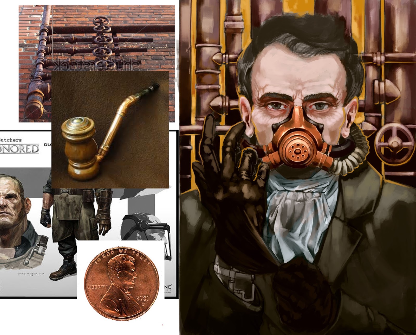
Steam Powered Motivation


So.....erm....it's been a while but I have new work to show you and this should be the first post of me getting back to blogging! So why the absence I hear you cry?! Honestly it's been a combination of a few things, art burn out, job hunting and uncertainty in myself, it just got to a stage where I had no confidence or motivation to pick up my graphics tablet. Then Dave Rapozza came along!
 
I recently bought his bog witch tutorial on gumroad and it really opened my eyes, he talks a lot about how he got to the stage he is at (super awesome amazing artist stage that is). A lot of what he was saying I could really relate to, I began to feel that motivation coming back. I also bought Dave Luvisi's tutorial on creating an IP on gumroad and he said something that really stuck. "While you're not working on your craft, someone out there is and they are getting better than you". 
 
So I did some doodling and came up with some fun little steampunk style characters you can see below, oh and a Barely Alive character doodle. A few of these I really liked but had no idea what to do with them, so going back to the Dave Rapozza tutorial I decided to take one and incorporate it into a portrait. Working on the things that I struggle with, such as; backgrounds, eyes and texture. It's been tough with the above piece coming up to about ten hours work now but I'm really pleased with how it's turning out, I hope you guys like it and I promise to blog more often than I have been recently. Till next time! 


Saturday, 12 September 2015

Sparkles The Shark Doggy


So you know that soft spot the space pirate was going to have, well here it is.........I am pleased to introduce sparkles! Hahaha don't you just love it when you can have fun with your art and don't have to be that serious. Sparkles is the pride and joy of the pirate and woe betide anyone who lay's a finger on him (yes it's a him, I thought that would add to the humour).

As my first attempt at painting or designing anything animal related I am pretty happy with this little fella, obviously there are things that could be adjusted but for once I am actually going to be positive about my work. I've also nearly finished my Requin portrait so you should be seeing that in a few days. Till next time!

Thursday, 10 September 2015

Space Shark Pirate

 
So it's another month which means there is a new CubeBrush competition. The brief is to create a space pirate or a more traditional pirate, as you can see above I've gone for a space pirate, humanoid sharks aren't very traditional you see.
 
With not winning the last competition I am really going to push myself on this one, need to notch a win! Personality and an environment are going to be key to this, I think. Environment wise I'm still uncertain of were I am going to place him but I definitely know what type of personality I want for him. I'm thinking aggressive and merciless but with a soft spot......that soft will be revealed later though. Till next time!

Saturday, 5 September 2015

Requin

 
I'm back again at portraits but this one has more character design, he's based off a character from the book "Red Seas Under Red Skies". Here's what I based most of his look from....
 
"The statue like the man had prominent curving cheekbones that lent the narrow face a sense of mirth - plus a round protruding chin, wide eyes and large ears that seemed to have been jammed into the head at right angles. Requin, whose features bore a fair resemblance to a marionette put together in a haste by a somewhat irate puppeteer.
Bristling curls of steel-grey hair atop his head receding more sharply. He wore optics that glowed a translucent orange, giving a demonic cast to the wide eyes behind them.
His narrow frock coat was crushed black velvet, and his hands were covered with brown leather gloves."
I think I have kept to the original description pretty while still putting in some of my own touches, the glasses is purely how I envisioned them, so may not look how the author intended them. I thought they would look like his eyes were burning, as if to stare into his eyes was to stare into the eyes of a demon. I must say though I am struggling to render the crushed black velvet coat, it's such a weird material!
 
I've put the greyscale version in here too, so you can see how much I render out an illustration before moving over too colour. Greyscale for me has become more of a way to make sure everything reads correctly and looks like it should in real life, I find that when I jump straight into colour things can become very muddy quickly. It's something I need to work on. Till next time!


Thursday, 3 September 2015

Forest Spirit


 Big bumper update for you guys today! I have been playing a lot of Hearthstone lately and even gotten back into World Of Warcraft, I know, shame on me. However these games have inspired me to create an illustration that you could possibly see in one of those games. My first stop, as is becoming common with me, was to just doodle out a few ideas in silhouette form.


I quite liked the crouching guy so simply threw him on his own canvas and started rendering in some details and giving him more form on a greyscale layer. A simple gradient map and colour layer later and it was time to start rendering him in colour. His face was something I really wanted to push with this one, I generally paint grumpy looking evil guys, with a stern expression. I thought it would be more interesting to make him look a little innocent/scared.

 
As you can see I came back to him a few days later and did a lot of re working, I thought his pose was a little stiff, so added the staff arm. The rocky parts also got reworked, to have a new design on them which hopefully looks a little more interesting, finally I did a lot of changes to the background to make it a little more readable and help draw the viewers eye to the character himself. There a still a few more things I want to add however, such as small animals scampering around him, to really reinforce him being a forest spirit.
 
I recently got some feedback on the most current version, so I am going to address those and hopefully finish him up this weekend. Till next time!


Friday, 28 August 2015

Nautical Golem

 
I finished my Cubebrush golem entry! After much messing around with it, I finally got it to a place I was happy with. The main goal with this piece was to try and push more of his story into the overall image. Who is he?? What does he do?? What's his purpose?? I might not have pulled it off overall but I definitely learned a lot about this process.
 
I feel like I am beginning to get some of the much sought after texture in my work now to. So everything feels like it could be something from the real world and not something that looks overly rendered, making it look very smooth (like my work used to). I hope you guys like him though, he has a sort of dim charm don't you think?? Till next time!

Thursday, 20 August 2015

Cubebrush Golem Entry So Far


So it's only a few days until the deadline for the Cuberush golem competition, so I thought it was high time I started designing something for it! My initial steps were to make a bunch of simple silhouettes, to try and find a theme or basic look for my golem. I soon began to start playing around with a nautical theme, thus the chains, anchors and bits of ships jutting out from them.


With a rough outline of what I wanted from this character I then did a second pass on a few of the silhouettes, exploring the nautical theme in a little more detail. His story began to develop a little more with these sketches, I didn't just imagine him as a simple golem but a bruiser for a pirate ship. The ships magician could've created him while they were out at sea, so all he had available to combine together was stuff from the ocean itself. Ominous, powerful but not particularly intelligent,  were themes I was trying to get across.

 
After that I picked my favourite out of those four and did a much more rendered pass at a design for the golem, making sure to have plenty of inspiration and references. He certainly evolved a lot from the loose sketch, replacing the metal banded rib cage with a buckling barrel. Looks like a little friend has also taken up residence in there! Huge pirates of the Caribbean influences going on here but I hope they still look their own thing. What do you guys think of my nautical golem? Do you think I'm going an interesting direction? Till next time!

Tuesday, 18 August 2015

The Journey Begins

 
It's been a week and I haven't uploaded a single post! I do apologise but not a great deal, I was too busy enjoying the sun in Spain but I'm back now and I have a new painting for you guys. Even though I couldn't get my hands on Photoshop while on holiday (purely a desktop man you see) I did do a few sketches and thumbnails and the above image is the product of one of those.
 
I actually have ideas for about five more paintings, all of them chronicling the journey of this man, almost like a mini series of paintings. This first one is him taking his first steps on his journey, the great statue is marking the borders of his home country and he has no idea what lies beyond those hills.
 
 
The top image is actually my second pass at the painting, the second one is were I was originally going to leave the piece. I hope you can agree that the top one pops a little more. I used predominately phot textures for the basis of this piece, which I think makes it look a little more "alive" than my previous environments, what do you guys think?? Till next time!
 

Friday, 7 August 2015

Dishonored Portrait

 
After spending the past few weeks studying environments I was itching to get back to creating some character art. My original plan was to start on my contest piece for the Cube Brush golem challenge but I got distracted with my excitement for the Dishonored definitive addition coming at the end of the month.
 
The above piece is an original character, however he was done in the style of the Dishonored concept art, I love how loose the brush strokes are in those pieces, they give a lot of energy to a piece which I think is somewhat lacking in my work. Hoping to transfer what I've learnt from this piece over to my own work and it's definitely got me wanting to create more portraits. Till next time!
 
P.S: Here's the link for the Cubebrush challenge if anyone is interested.

Wednesday, 5 August 2015

Biome Studies


I'm back at university it feels like at the moment! After the feedback I received on the forgotten pool I really wanted to take a step back from creating fully rendered images and wanted to focus on the fundamentals.


My first port of call was to just grab a load of reference images, for particular things I wanted in these scenes. So for the desert environment, I need to see how sand works, how it reacts to light and how it holds it's shape. I also needed to see what types of plant life grow in desert environments, it's not going to be lovely rose bushes now is it. With all the reference collected I spent about four to six hours on each scene trying to remain true to how these things work in real life but trying to avoid spending hours rendering a rock. I learned a heck a lot from these and hop to apply this to a new environment painting, hopefully that will be an improvement on my last one. Till next time!

Tuesday, 28 July 2015

The Forgotten Pool

 
I got inspired lately to create an environment piece, after going up Coniston in the lake district. The countryside around there really is beautiful and I wanted to try and capture that magical forest feeling within a painting. Obviously I couldn't just paint a plain forest, I still had to sneak a little bit of fantasy in there, thus the giant stone hand!
 
It got suggested to me that the piece is lacking some life to it, especially the water, which I can't help but agree with. So I am going to adjust that and possibly add some wildlife to the piece. I'm thinking maybe a few birds flying around or perched on the hand, as that is the focal point of the painting. So you may see this piece again. Till next time!

Friday, 24 July 2015

Marine Salvage Robot

 
So here's the final product of those alchemy silhouettes I created a few weeks back. I ended up choosing the fifth design from the previous piece I showed you guys for the basic design of this guy. I did change a few things on the final concept, such as the feet, the arm plating and the shoulders. They were all pretty small changes but it made the overall design look a little more grounded. That was one of the main goals with this piece, to create something that looks like it could function in our world and had an actual purpose behind it.
 
 I imagine this robot would be sent down into areas of the sea that are deemed too dangerous or too hazardous for humans. While it is in those areas it's tasked with collecting salvage and relics. It also has a secondary function in the form of the giant canister attached to the front of it. The idea would be that it can store trapped divers in there, supplying oxygen to them from it's helmet, while it takes them to safety.
 
I learned a heck of a lot from this piece, one being that I am not as scared of colures as I used to be and I'm getting more of an understanding of how shadows work. Still a lot more to learn though, so I will get back to it. Till next time!


Saturday, 18 July 2015

Robots And Desolate Wasteland

 
So you remember those robot silhouettes from about a week ago, well I took a few of them and made some more fleshed out designs of them. My main goal with the designs was to make something look a little more believable, with actual joints, gears and bits of machinery. I did this by using a lot of photos and painting over them until I got something I liked, I used car engine parts, spark plugs and medical equipment to name a few of my references. This sped up my design process a lot, as I wasn't trying to invent these mechanical parts, so I can focus on the overall design of the robot instead. The photos also informed a lot of the look of the robots, such as the armoured plating, I'm hoping to push these methods and concepts further by adding photo textures to make them look more realistic. The fifth design is probably the one I will do these experiments on!   
 
 
In a bid to not just focus on character design I have also been doodling some thumbnails for a environment piece. I've had in my head for a while now, it's based on a extract from a book I am currently reading called, The Left Hand Of God, more on that later on though. Till next time!
 

Wednesday, 8 July 2015

Alchemy

 
So in a bid to try improve how long it takes me to come up with initial sketches and designs I have decided to go back to a programme I was shown in my first year of university. Alchemy is a free programme which lets you quickly make shapes, these can be then used as the basis for character designs or possibly environments. The above image was made for just that purpose, I wanted to design a robot but always struggle coming up with shapes quickly, without getting caught up in my line art, so I thought why not give alchemy a crack.
 
I'm going to take about four of these designs and throw some more paint on them, see if I can't flesh them out into something cool. Hopefully will have a few pages of designs and concepts which I can then use to make a character illustration at the end, got to keep building that portfolio! Thinking of possibly making an alien species with this technique. Till next time.
 
Here's a link to the alchemy site if anyone is interested - http://al.chemy.org/